
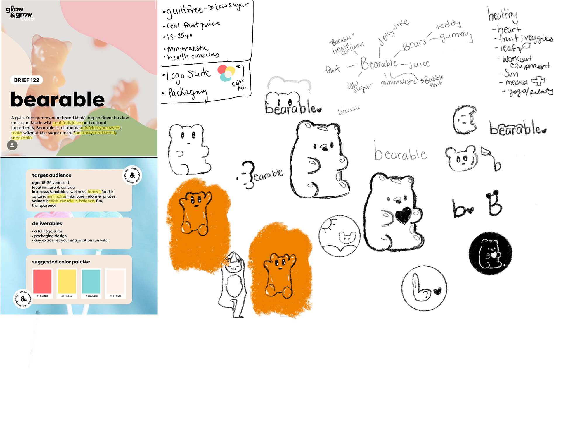
Bearable Brief
A gummy bear brand that is big on flavor and low on sugar.
My role: Graphic Designer
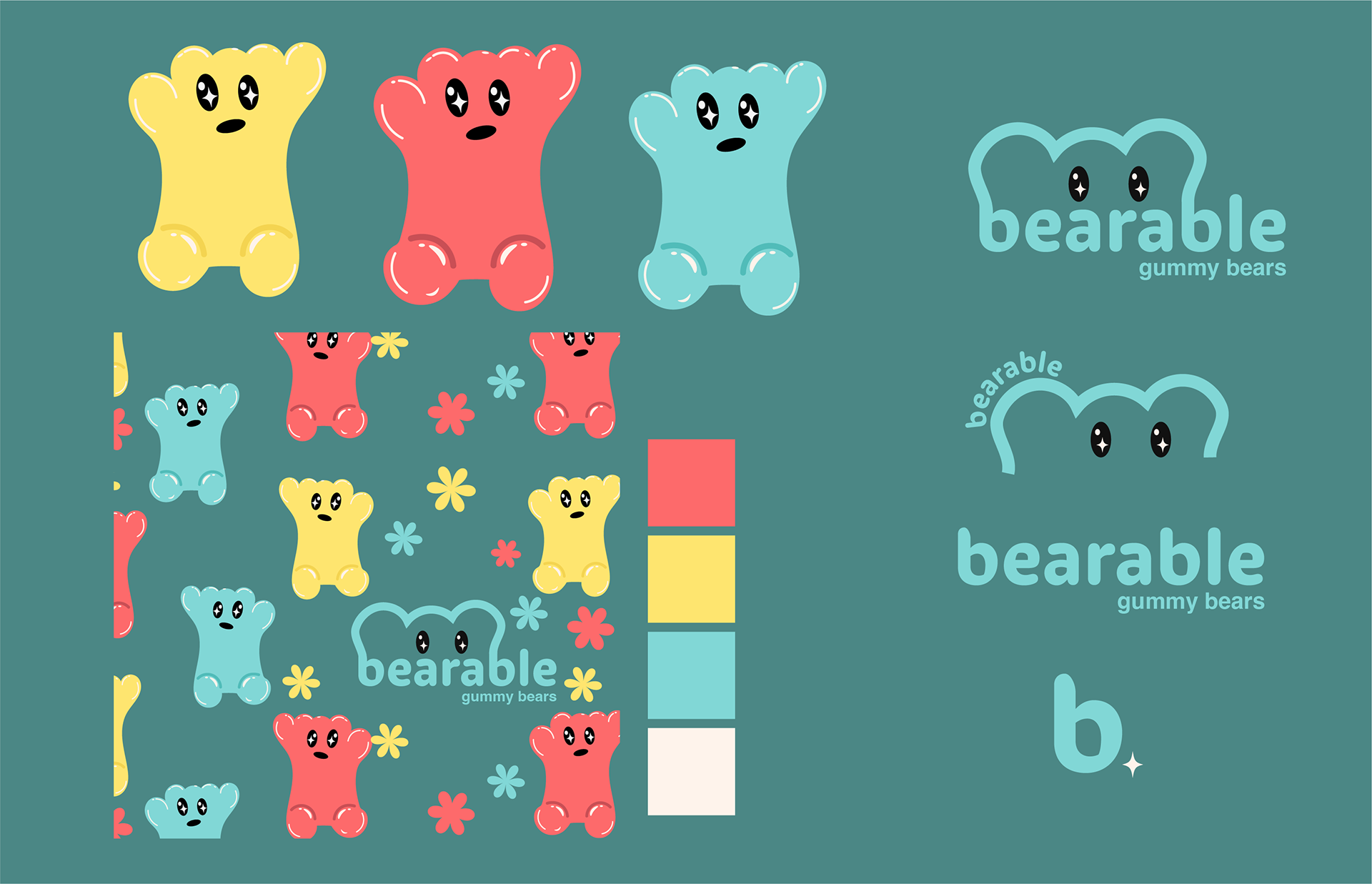
Color palette provided via brief.
Demographics: 18-35 years old in the USA and Canada
Psychographics:
Interests: wellness, fitness, foodie culture, minimalism, skincare, reformer pilates.
Values: Health-conscious, balance, fun, transparency
Design Rationale
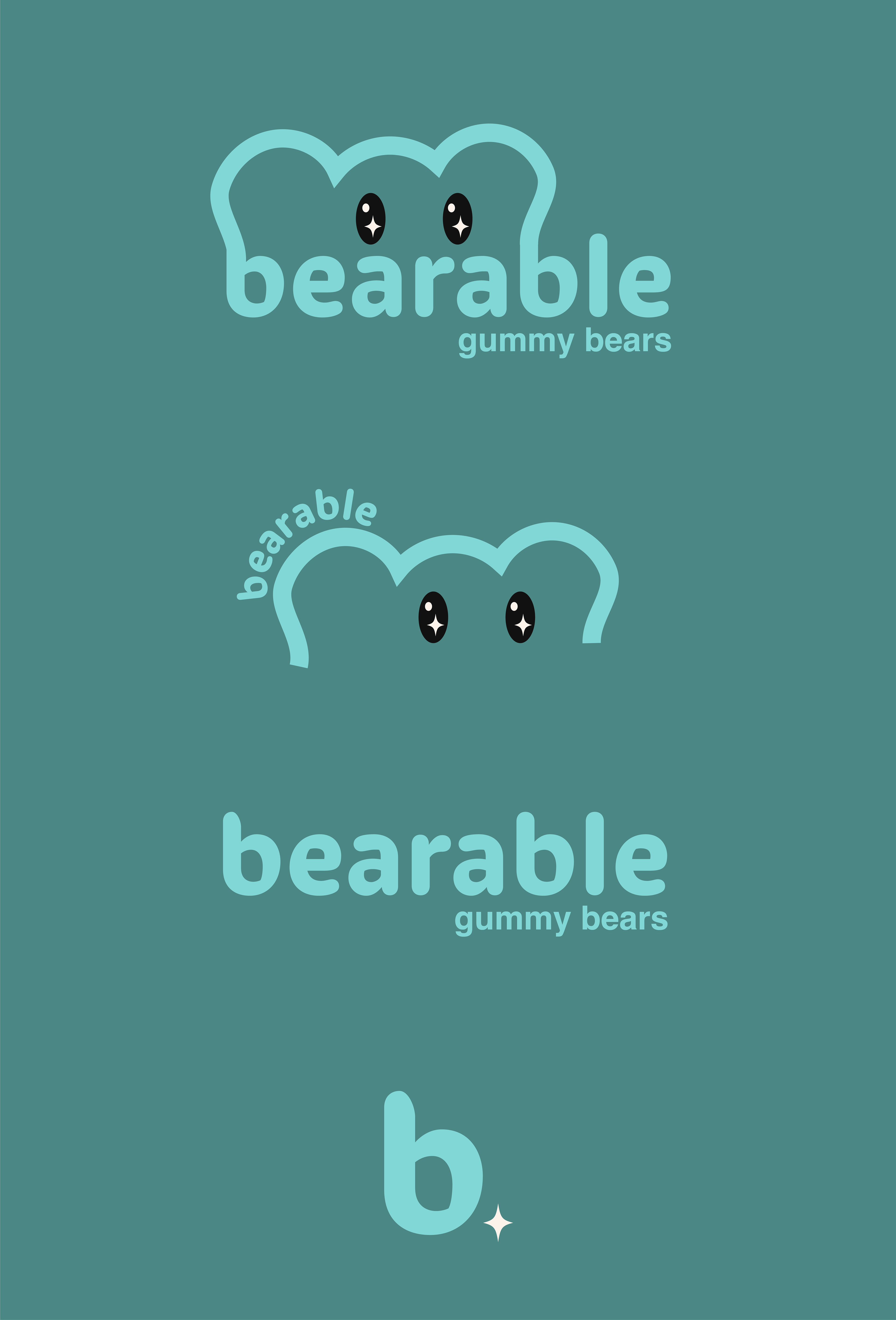
I found an image of a bear doing yoga and noticed how stretched its arms were. I recreated that in gummy bear form.
I was provided with a color scheme, and I decided to stick with it. It turned out to be more challenging than expected. The scheme felt childish, making it difficult to achieve an adult and minimal aesthetic with the colors.
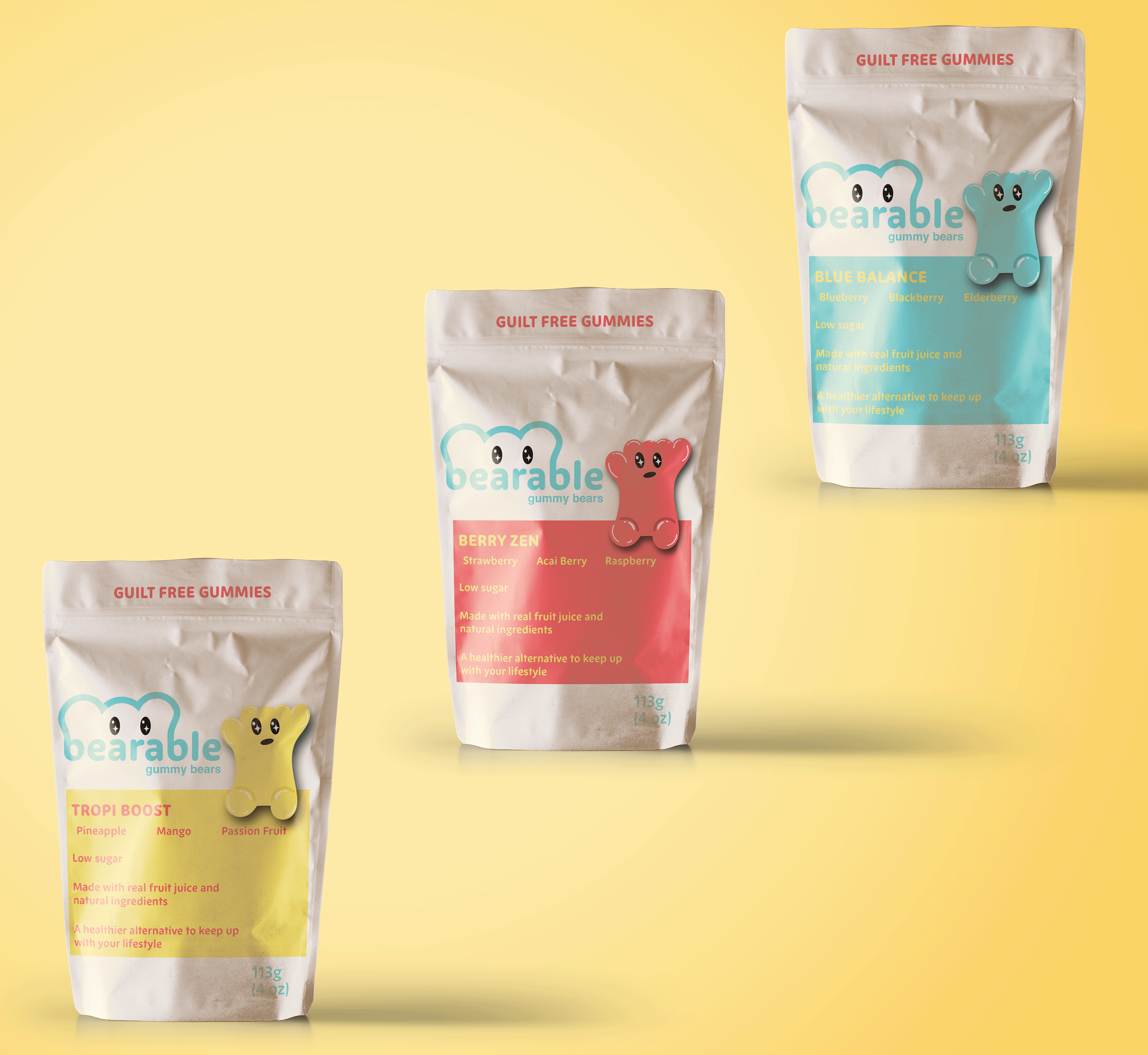
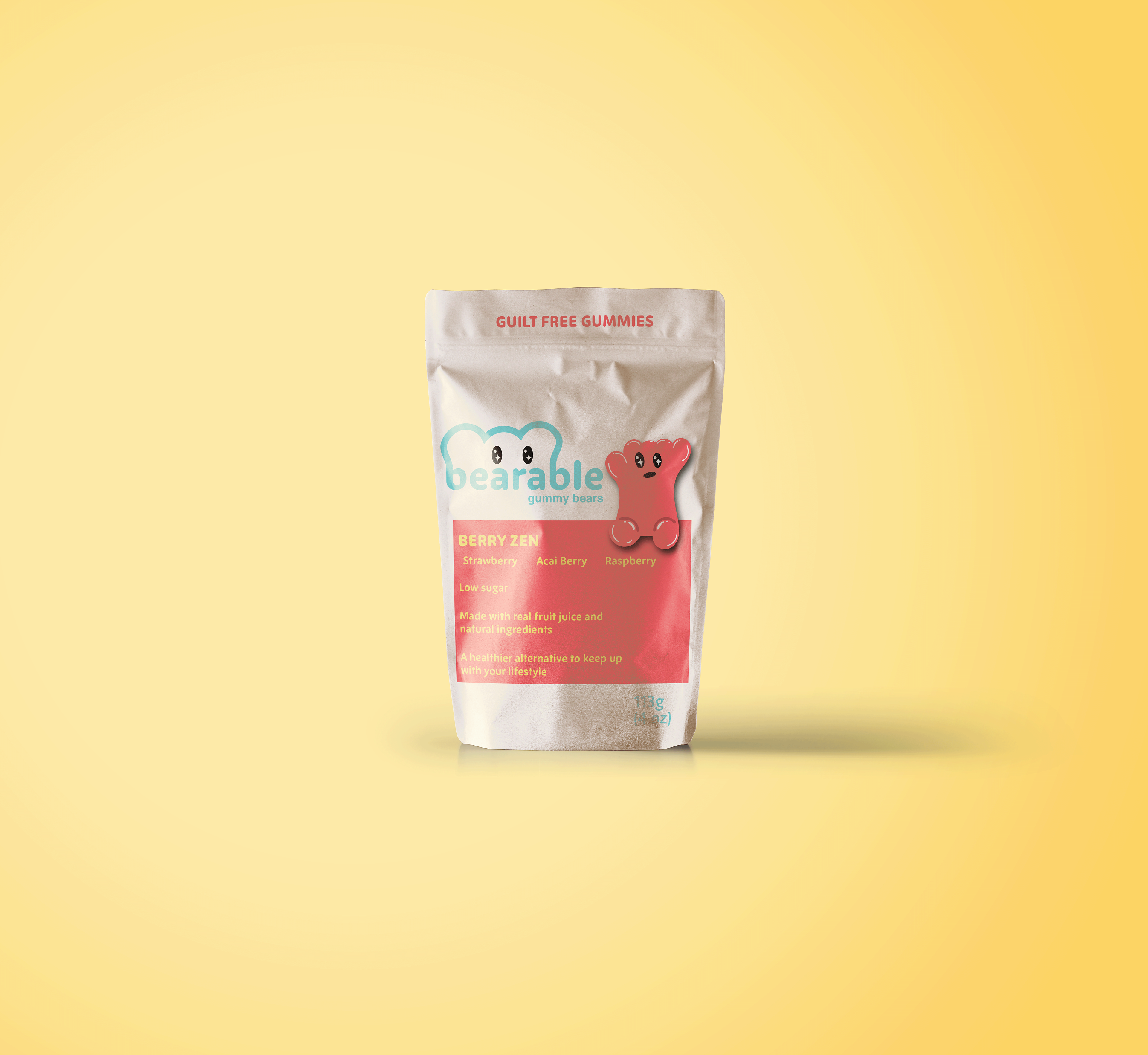
To address the color scheme issues, I utilized colors to represent different flavors and indicated the flavor at a glance.
Flowers were added to the pattern asset to symbolize growth and revitalization.
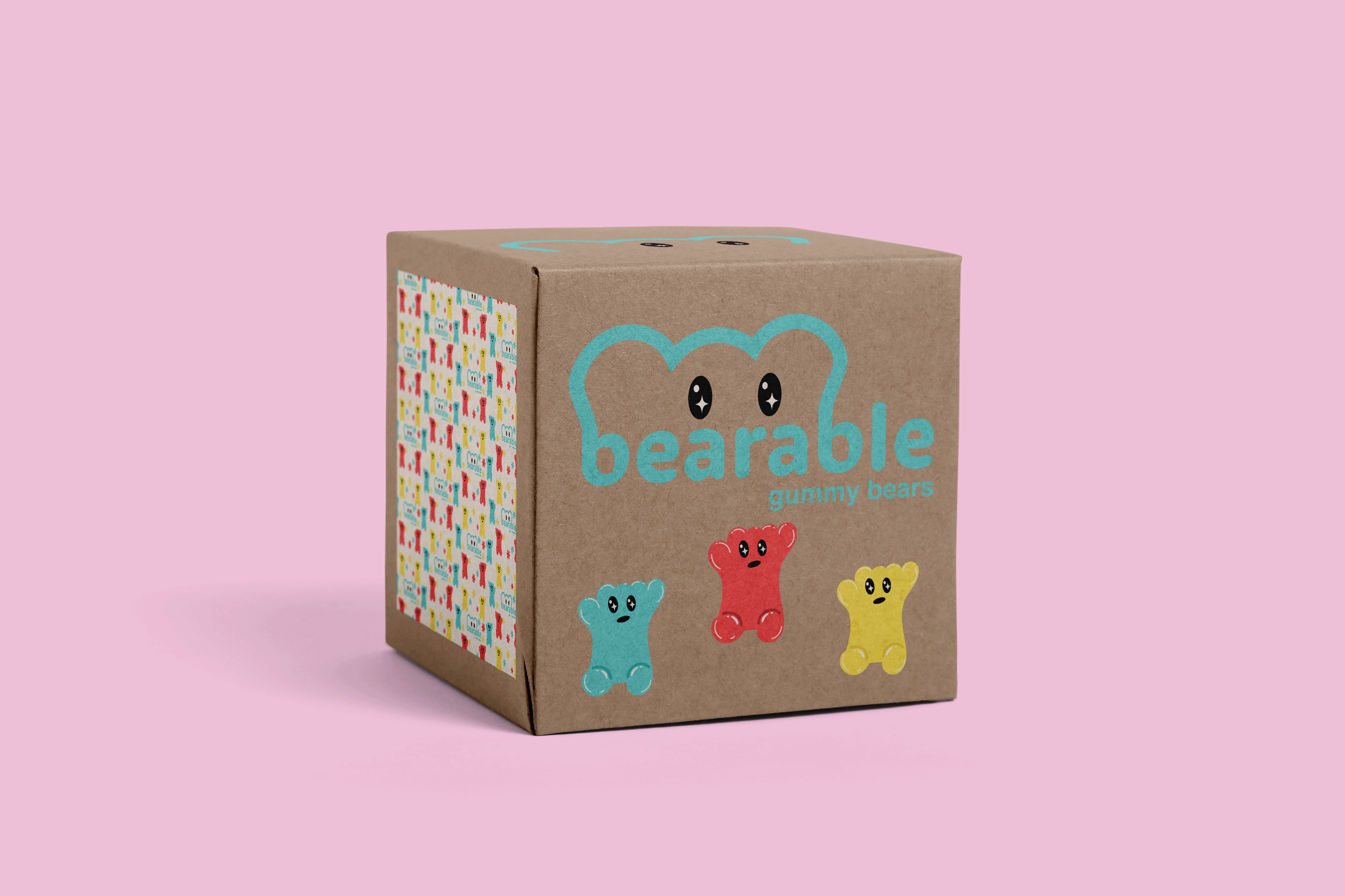
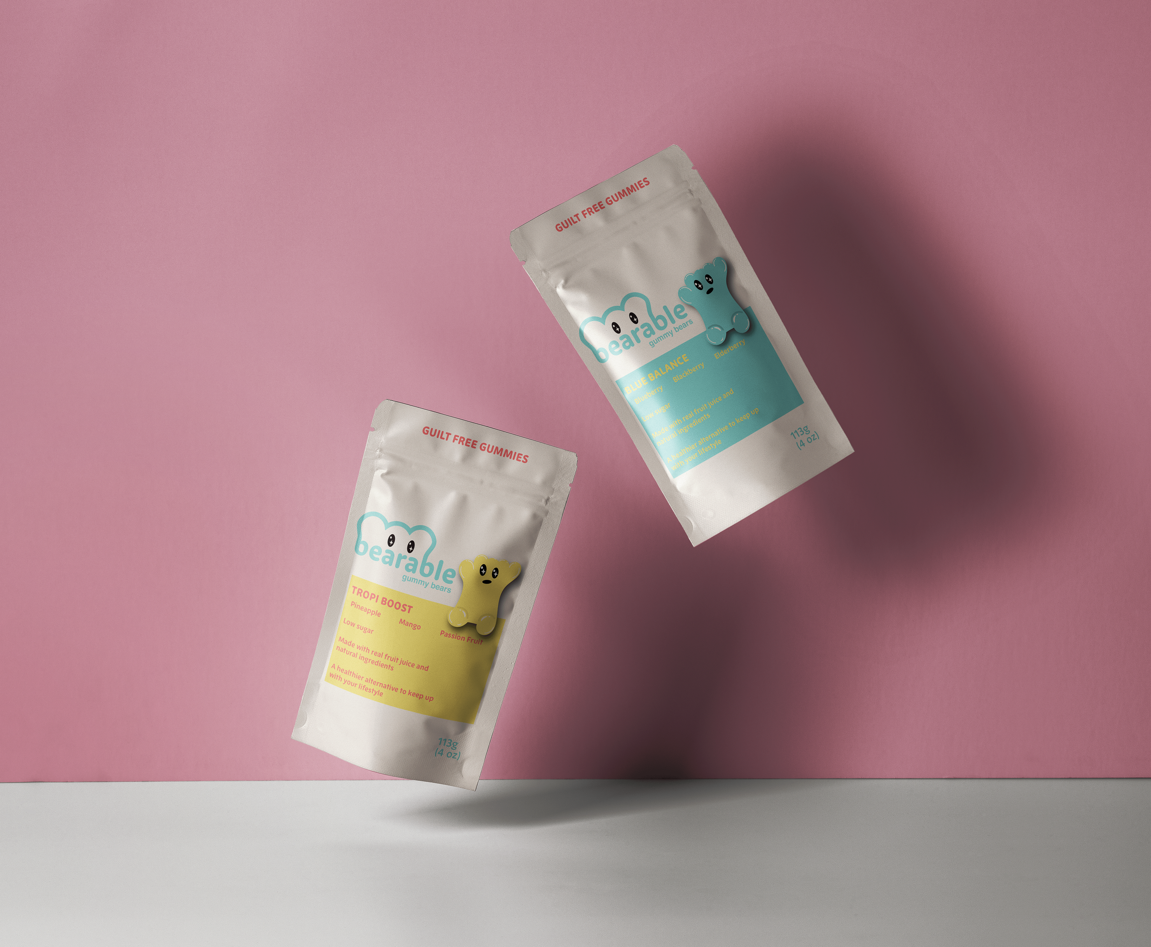
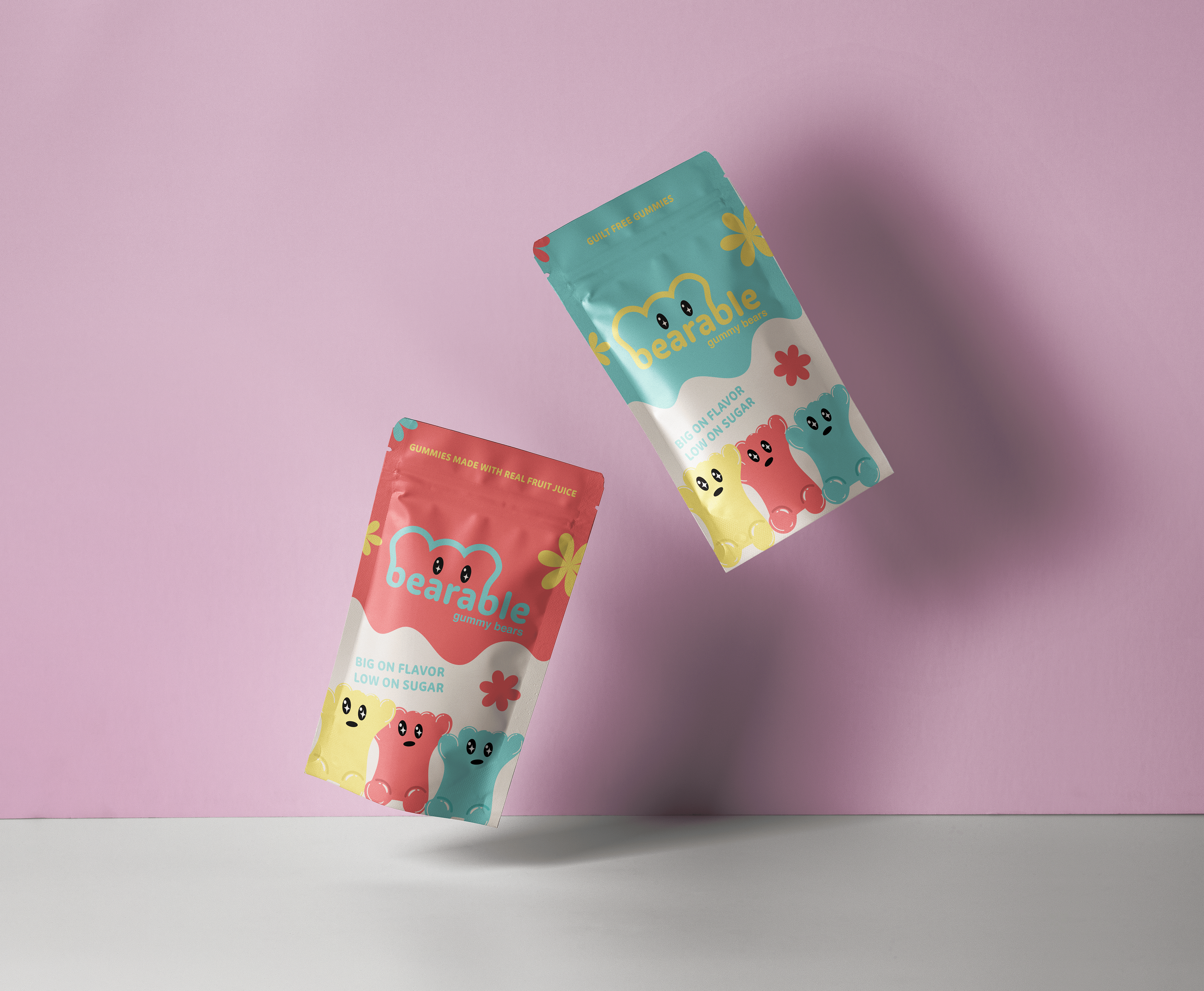
Packaging
"Guilt-Free Gummies" is prominently displayed at the top of the packaging, making it the first thing a consumer notices upon opening.
The reasoning behind its guilt-free claim is explained after the flavor section: it is low in sugar and made with real fruit juice, claiming to be a healthier alternative that fits the consumer's lifestyle.
The reasoning behind its guilt-free claim is explained after the flavor section: it is low in sugar and made with real fruit juice, claiming to be a healthier alternative that fits the consumer's lifestyle.

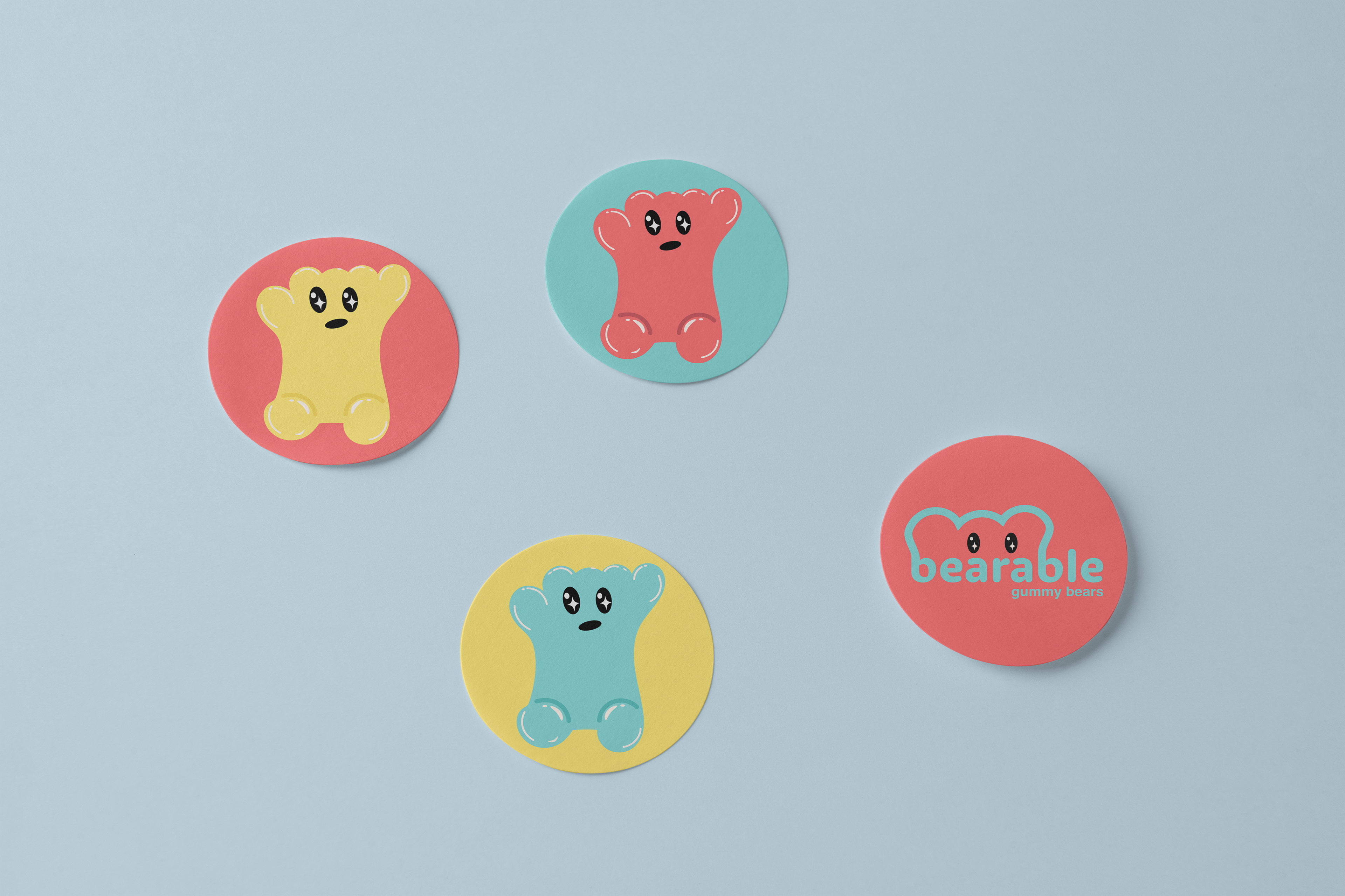
Scrapped Concept
The packaging I designed felt too playful and aimed at children instead of an adult audience. I also did not include any flavors, and it wasn't immediately clear what the flavor might be at first glance.
I went back to the drawing board and did research. I researched the types of packaging that 18-35-year-olds tend to reach for, including minimalist packaging and common flavor combinations. I then started over with a better sense of competitors and what the demographic would like.
Programs Used
Adobe Illustrator
Adobe Photoshop