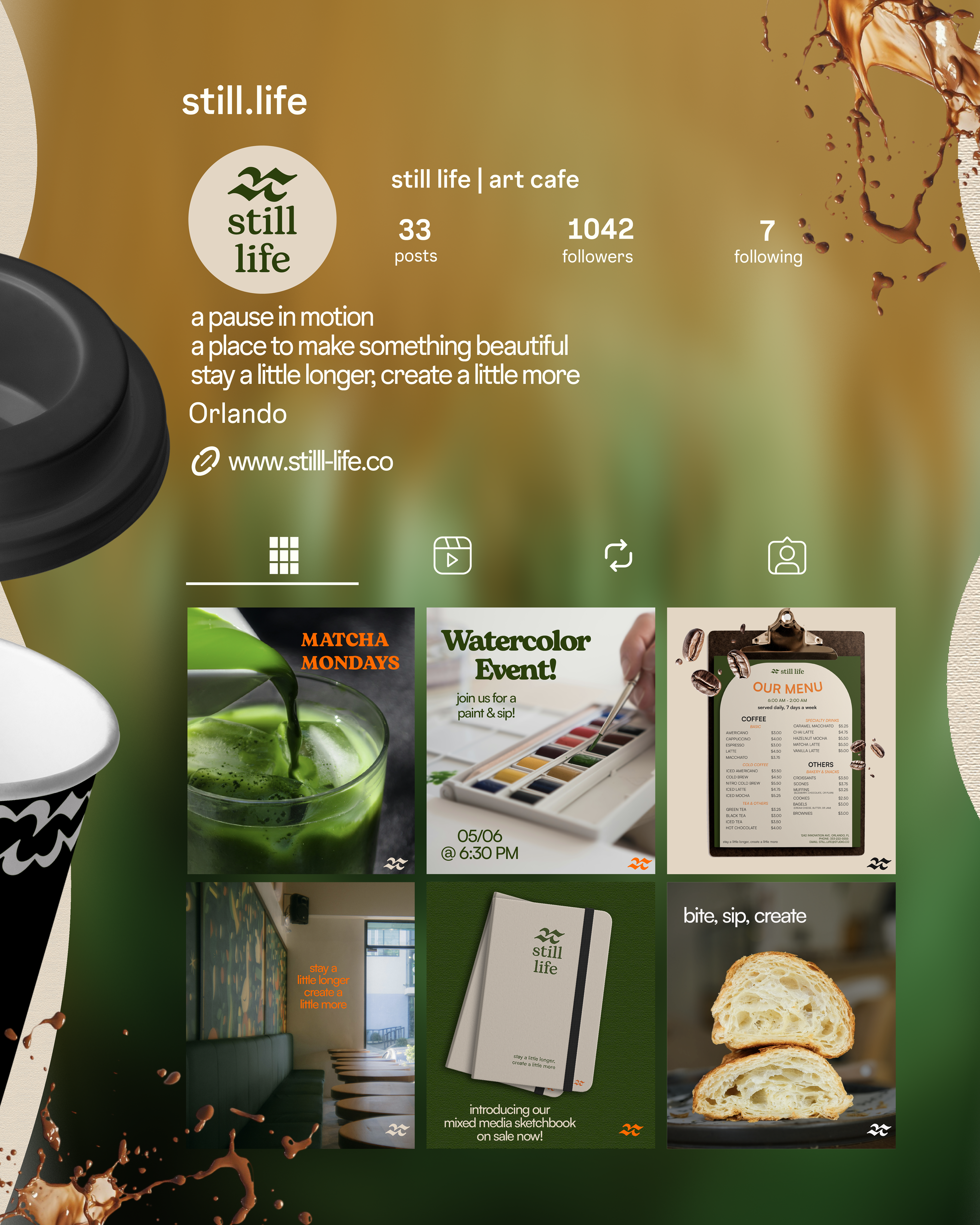
SCOPE/CONCEPT
The concept for this project was to develop a cohesive brand identity for Still Life, an art cafe designed as a space for creativity, connection, and slowing down. The primary goal was to create a visual identity that encourages slowing down, self expression, and community.
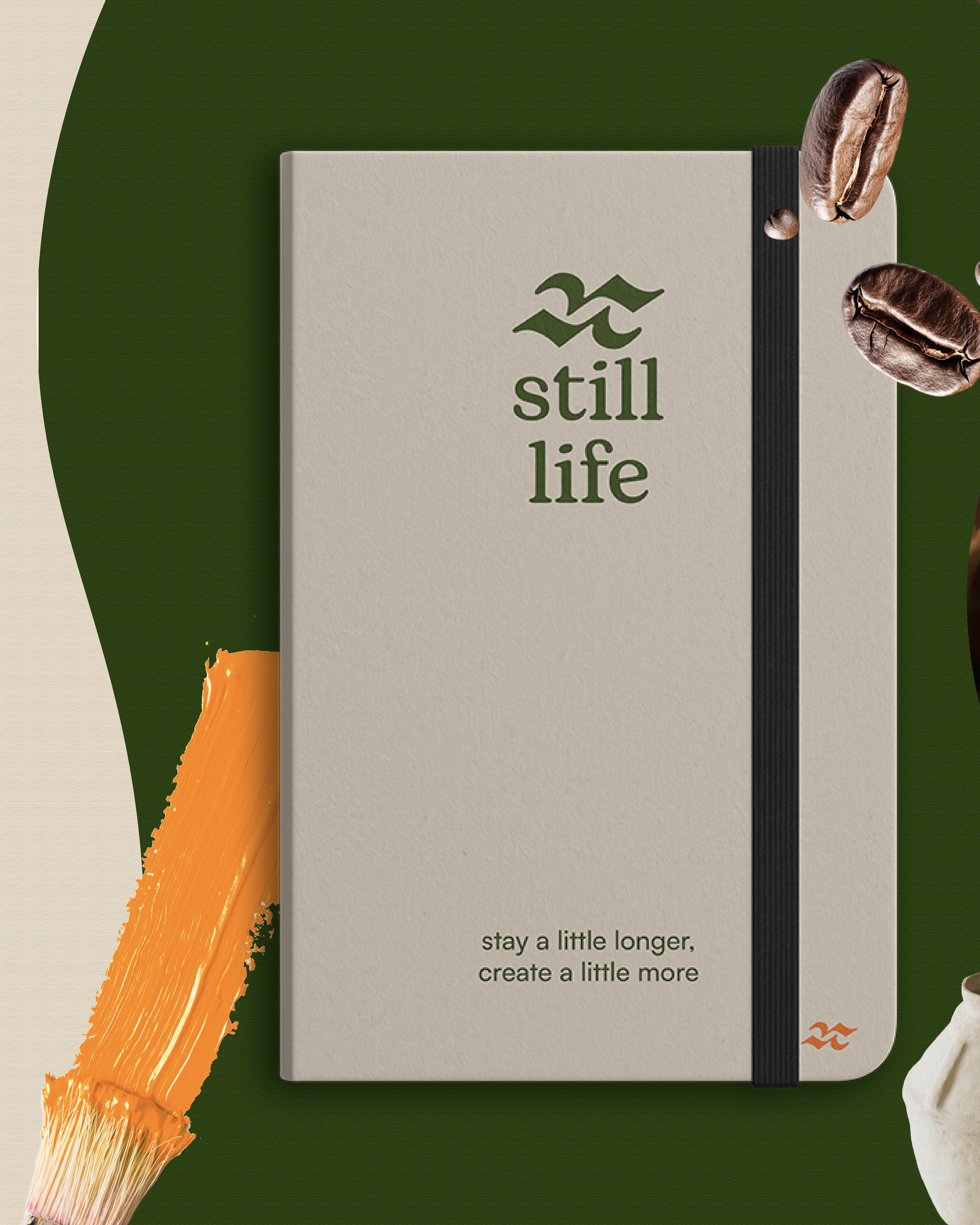
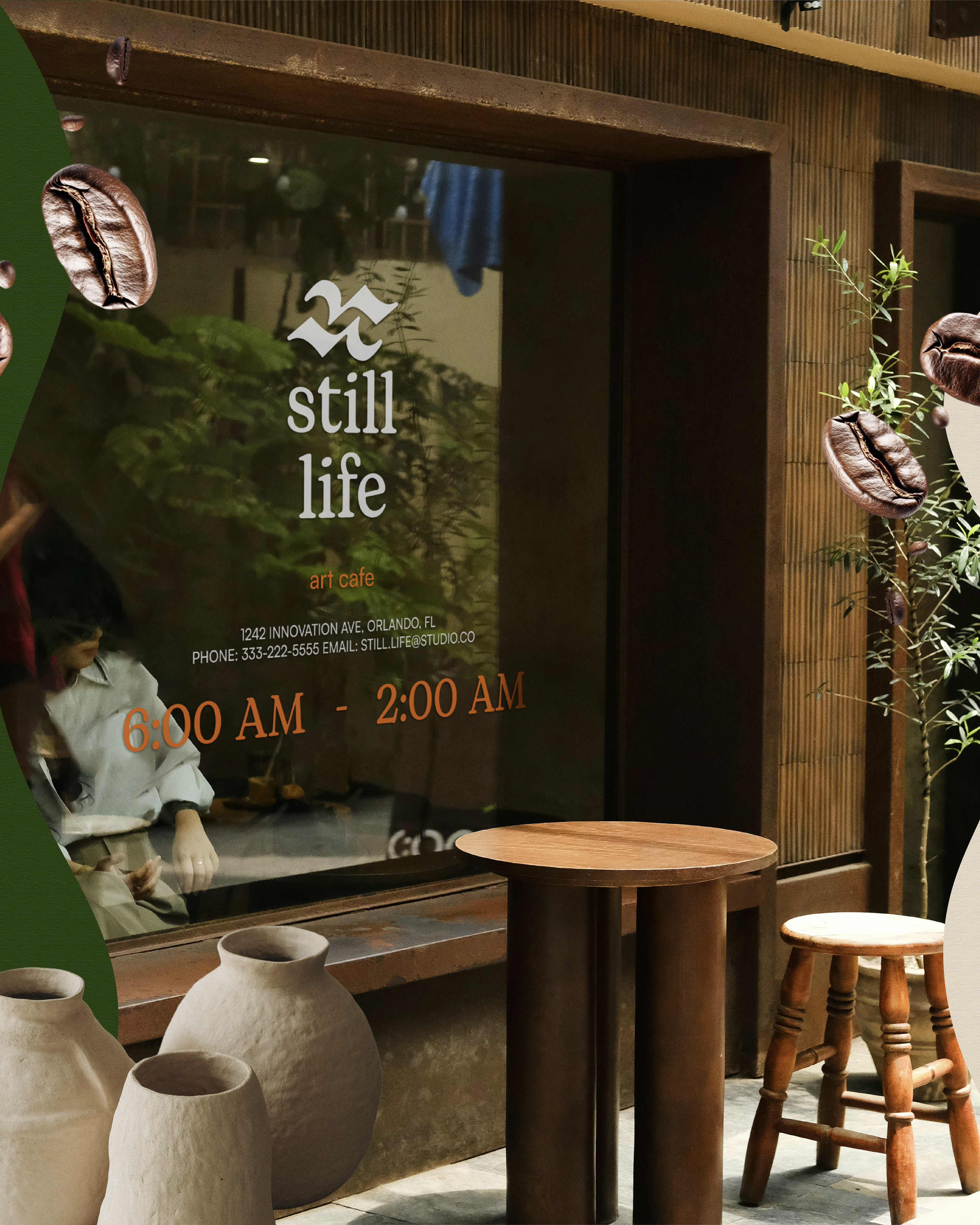
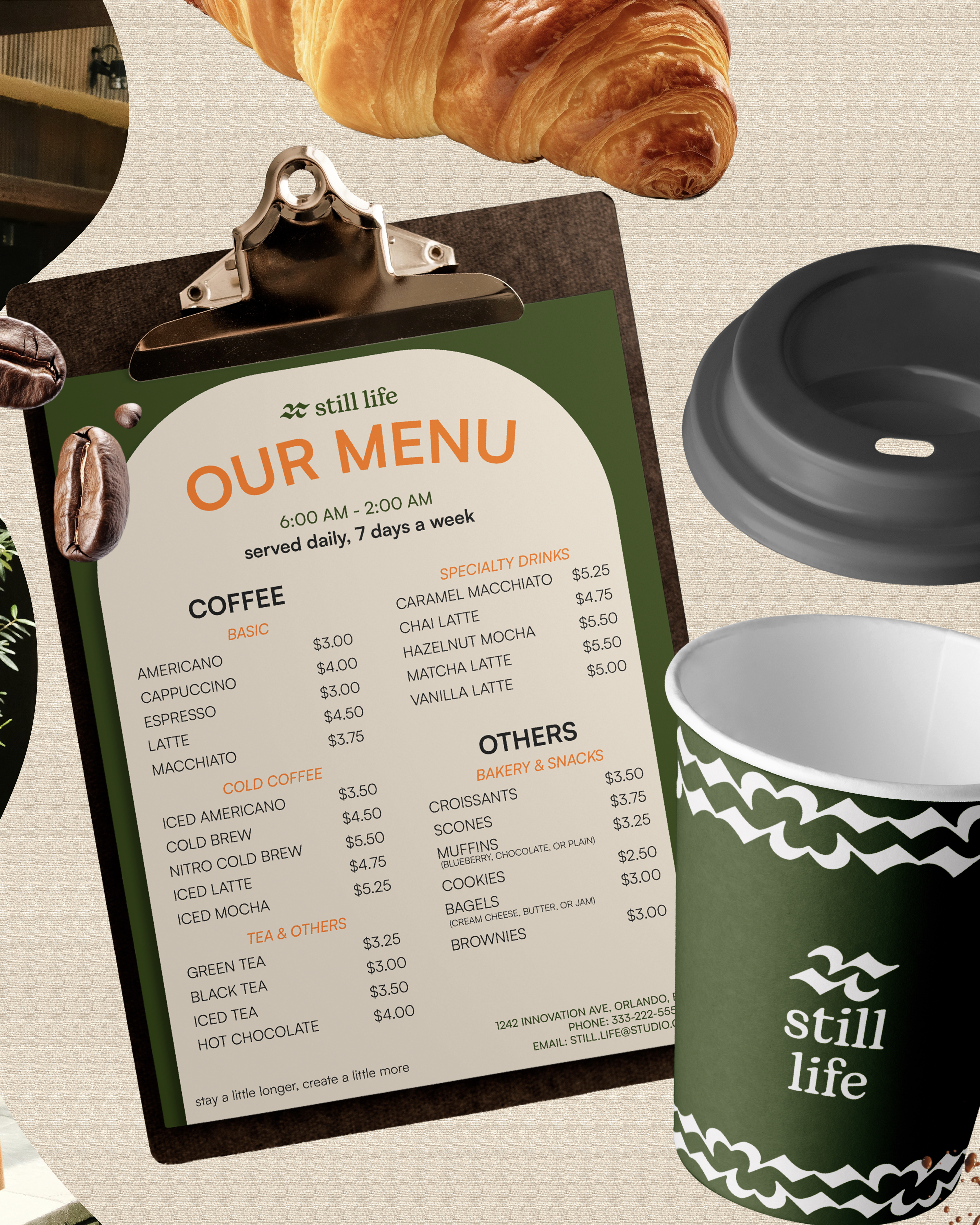
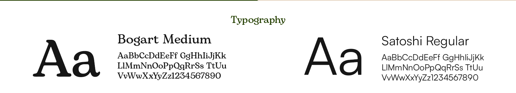
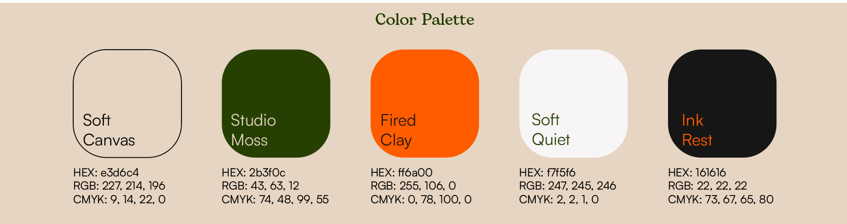
The project scope included designing a complete visual identity system including, logo, typography, color palette, and showing different brand applications. A key objective was to create a warm and inviting space that feels inspiring and collaborative, while remaining clean, scalable, and suitable for different use cases.
Research And Process
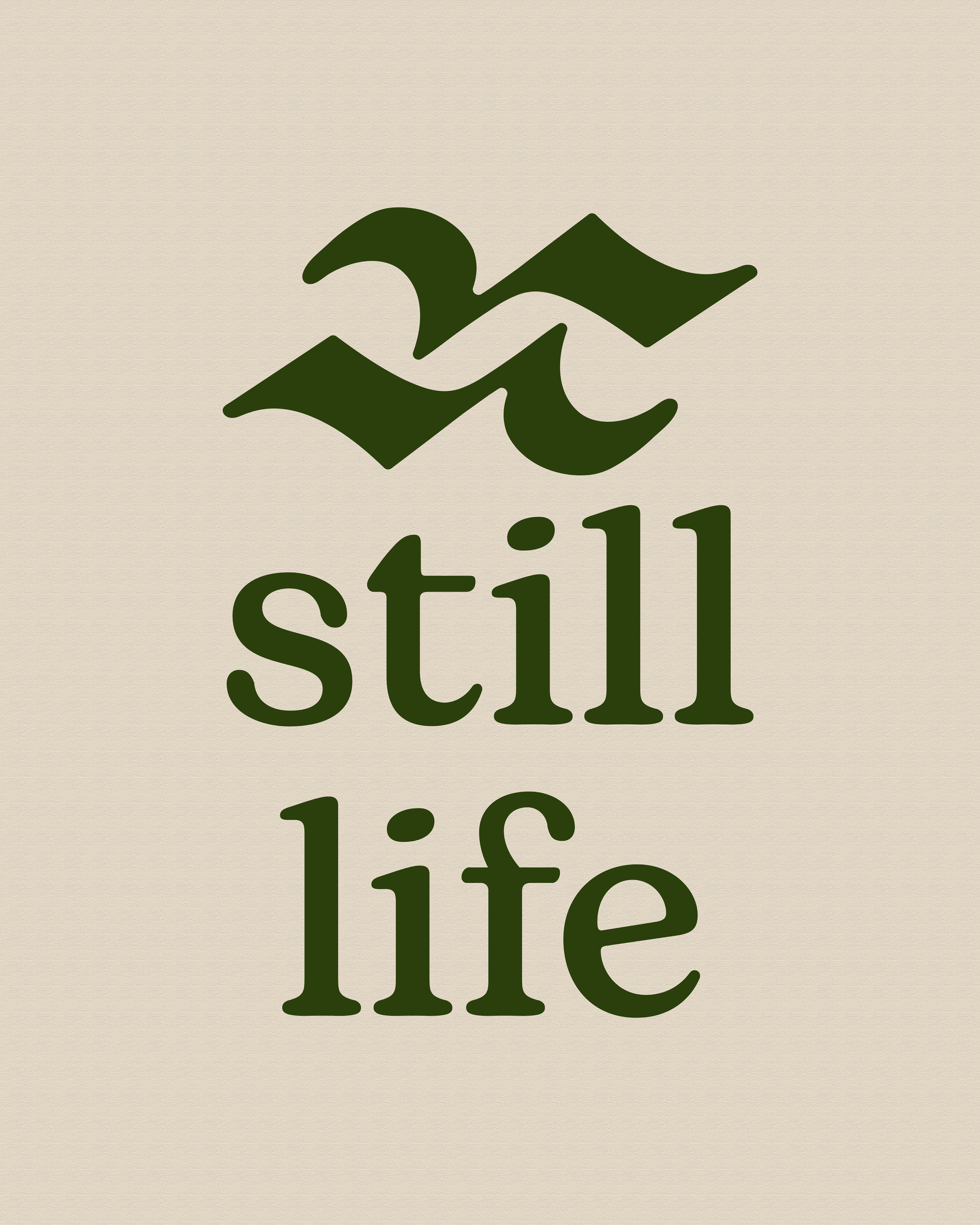
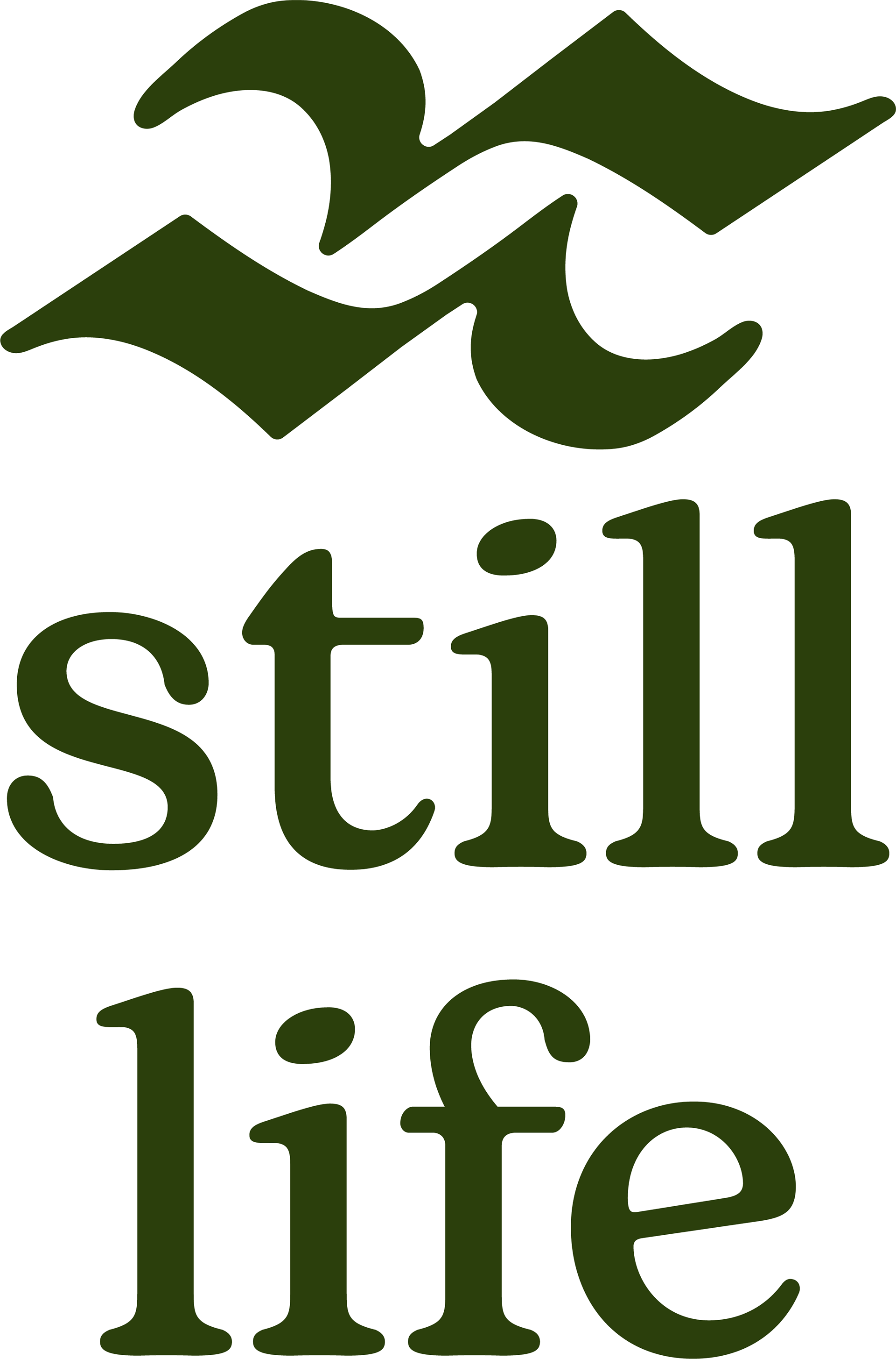
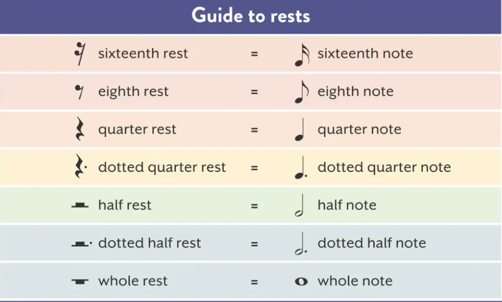
While researching different ways to visually show a "pause" without using a simple pause button, musical rests came up.
The musical pause is similar to commas, it shows where a pause is needed. In grammar and music, pauses are needed to emphasize points, inspire imagination, and allow reflection.
The musical quarter rest has a unique design. It's creative while still being minimal.
https://www.hoffmanacademy.com/blog/musical-rests
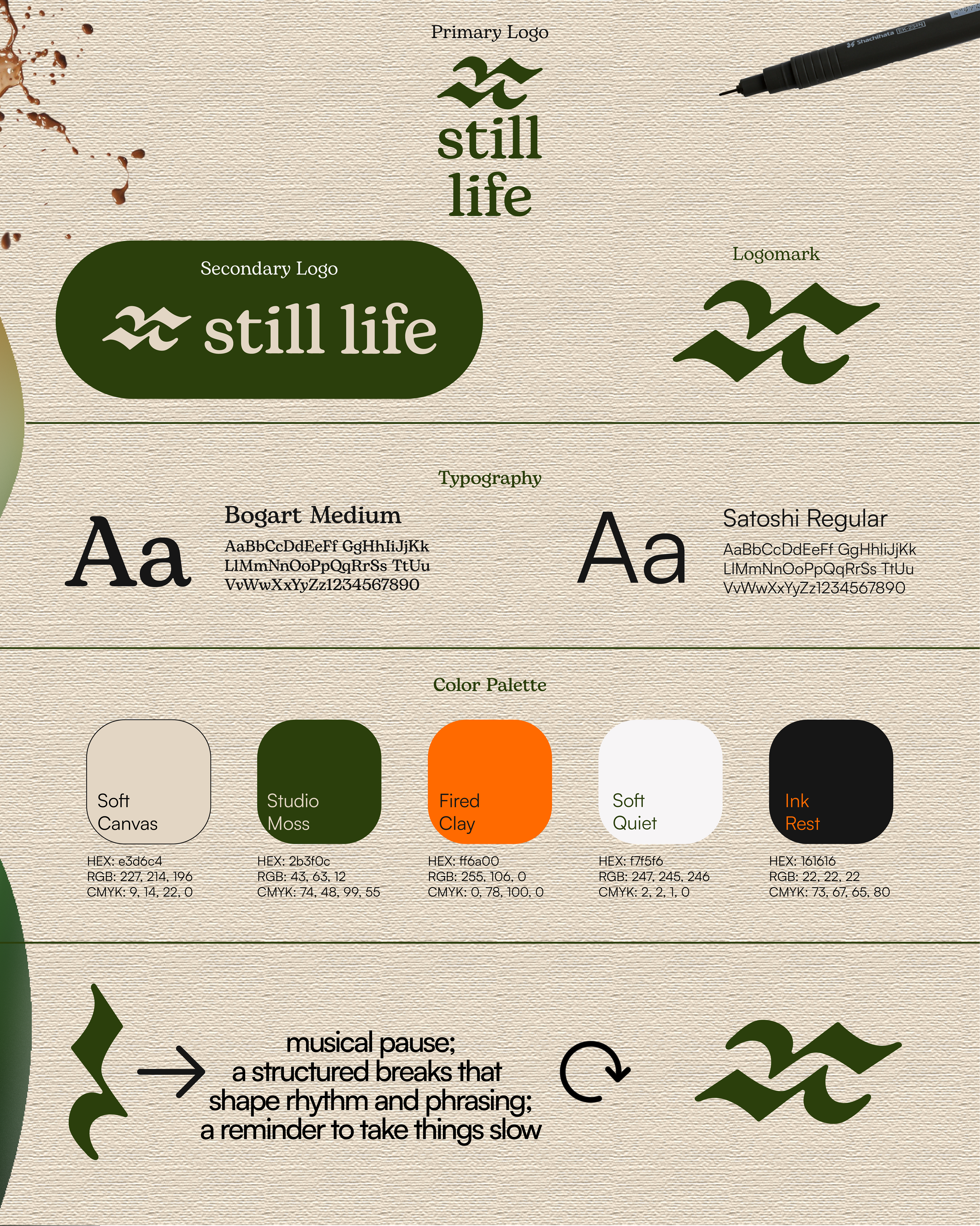
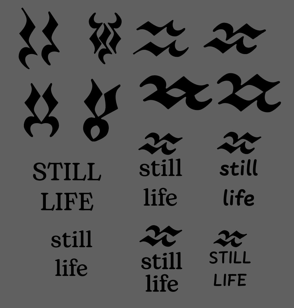
Different iterations of the quarter rest were explored. Many different typefaces were too. At first the idea was to find a typeface that was soft, rounded, and earthy. After deciding on the logo mark, a different approach was taken to match the minimalistic and sophisticated logo mark.
CHALLENGES
A challenge faced during the logo creation process was creating a logo suite. Logo suites are necessary to allow a brand to have versatility. When trying to create a logo mark, I had to create something unique and powerful enough to stand on its own.
Another challenge face was the color palette. A lot of coffee shops use neutral colors so differentiation was needed. The pop of orange scattered throughout the is inspiring and inviting.
The contrast was also checked and this set has many different use cases.
Mockups were also a bit tricky to find. There weren't many to show a coffee house.